Developers often have a need to create rows in a ListView that have multiple
interactive locations that the user can touch, instead of just one single clickable
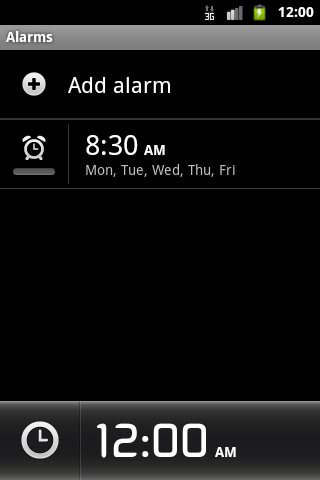
row. This is a pattern that even Google has employed in apps like the DeskClock.
DeskClock's Alarm tab display each list item with a small toggle button inside,
used to enable or disable each alarm. In addition, the remainder of the list item
is also touchable and takes the user to a screen to edit the alarm parameters.
Taking a quick survey of questions and answers found on the internet, you may discover
that many will say what I just described above is impossible. The common method for
adding a clickable item is to add a Button or ImageButton to a ListView row's
layout. The side-effect of doing this is that the remainder of the list item is no
longer selectable and this renders your OnItemClickListener useless! But then,
how is it that Google was able to accomplish this same task??
Luckily for us, Android is an open source project, so we can inspect what was
done in DeskClock, and learn from it.
The Problem is Focus
As developers, we all have the same natural tendency to pick either a Button or
ImageButton when we want to implement a clickable widget anywhere...including
inside of ListView. Sadly, this is where the downfall begins.
Button and ImageButton are not just subclasses of TextView and ImageView
with their CLICKABLE flag enabled; they are subclasses with their CLICKABLE
and FOCUSABLE flags enabled. ListView, by design, does not pass perform click
events on list items when those items contain FOCUSABLE views, regardless of how
you configured any of its other flags (ListView actually protects the PerformClick
method by first checking hasFocusable() on any list item).
Bottom line, in order to keep access to the default behavior of ListView, we
need to use child views in our row layouts that are CLICKABLE without being
FOCUSABLE.
Quick and Dirty
One option to circumvent this and still use typical buttons would be to create
layouts that are nothing but buttons, so that no area of the item layout exists
that is not clickable. This method, IMO, has one major drawback in that you
completely lose the position tracking ListView provides you for any of the item
clicks and you will have to manage that all yourself in the button's OnClickListener
methods.
However, in some cases this method may be desirable and I would suggest
that in those cases that you call setItemsCanFocus(true) on your ListView.
If you plan to fully obstruct the root layout with buttons, this method will allow
D-Pad and arrow focus changes to slide across all your buttons appropriately just
like it was the list item itself.
Losing the Focus
So how do we implement clickable views that don't also try to take focus?
Simple! Any view object has the ability to be made clickable by calling
setClickable(true) in Java or adding android:clickable="true" in XML.
Consider replacing a Button with a TextView made clickable, or an ImageButton
with an ImageView made clickable. Make a composite button out of some widgets
inside a LinearLayout and make the layout itself clickable.
Note: There is a shortcut here as well. You may not be aware of the fact that, anytime you call
setOnClickListener()on any View (even if the parameter is null), it will automatically set the CLICKABLE flag for the View for you. Since, in most cases you are probably making something clickable so you can listen for the event, you don't need to explicitly mark the flag on the views in your layout.
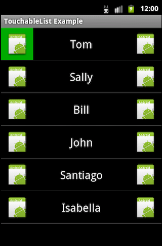
Here is an example of a layout that includes two ImageViews that we turn into clickable accessories by setting their clickable attribute:
<?xml version="1.0" encoding="utf-8"?>
<LinearLayout xmlns:android="http://schemas.android.com/apk/res/android"
  android:orientation="horizontal"
  android:layout_width="fill_parent"
  android:layout_height="?android:attr/listPreferredItemHeight">
  <ImageView
    android:id="@+id/left"
    android:layout_width="?android:attr/listPreferredItemHeight"
    android:layout_height="fill_parent"
    android:src="@drawable/icon"
    android:scaleType="center"
    android:clickable="true"
    android:background="@drawable/mybutton" />
  <TextView
    android:id="@+id/text"
    android:layout_width="fill_parent"
    android:layout_height="fill_parent"
    android:layout_weight="1"
    android:gravity="center"
    android:textAppearance="?android:attr/textAppearanceLarge" />
  <ImageView
    android:id="@+id/right"
    android:layout_width="?android:attr/listPreferredItemHeight"
    android:layout_height="fill_parent"
    android:src="@drawable/icon"
    android:scaleType="center"
    android:clickable="true"
    android:background="@drawable/mybutton" />
</LinearLayout>
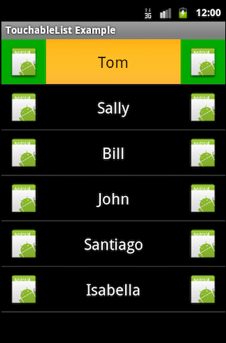
When this layout is used as the list item view, the item itself as well as each
individual ImageView are tappable by the user.
There may still be cases where you want to use the traditional Button (to keep
its styling, perhaps). By removing the FOCUSABLE flag from the buttons, they
can be safely added to the row layout while keeping the list item itself interactive.
This can be accomplished by calling setFocusable(false) from Java or
android:focusable="false" in XML.
Here is an example of another list item layout that uses buttons with their FOCUSABLE attribute removed:
<?xml version="1.0" encoding="utf-8"?>
<LinearLayout xmlns:android="http://schemas.android.com/apk/res/android"
  android:orientation="horizontal"
  android:layout_width="fill_parent"
  android:layout_height="?android:attr/listPreferredItemHeight"
  android:gravity="center_vertical">
  <TextView
    android:id="@+id/text"
    android:layout_width="fill_parent"
    android:layout_height="wrap_content"
    android:layout_weight="1"
    android:textAppearance="?android:attr/textAppearanceLarge" />
  <Button
    android:id="@+id/left"
    android:layout_width="wrap_content"
    android:layout_height="wrap_content"
    android:focusable="false"
    android:text="Accessory1" />
  <Button
    android:id="@+id/right"
    android:layout_width="wrap_content"
    android:layout_height="wrap_content"
    android:focusable="false"
    android:text="Accessory2" />
</LinearLayout>
With both of these examples, the list item itself is still clickable and that
event will register with the ListView's OnItemClickListener. The accessory
views will need listeners attached to them to monitor for their click events.
Download the sample code attached to this post and you can see an example of
attaching separate listeners to these views, including using tags to track the
row position.
A Note About Drawables
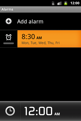
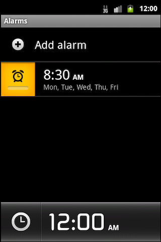
You may have noticed in some of the screenshots of the examples above that the drawable states of the selectable buttons mirror that of the parent layout. When the user presses the parent list item, the child buttons themselves are also highlighted. Depending on your particular application, this may be an undesirable effect. To find a solution to this problem, we turn again to the AOSP code for DeskClock. The accessory in each list item does not highlight when the alarm time is pressed. So how do we achieve this?
The key here is to define a custom widget that overrides the behavior of setPressed()
to ignore the calls to set this state when they come from the parent layout.
Here is an example of a custom ImageView that we can use in our first example
to handle this:
package com.examples.listzones;

import android.content.Context;
import android.util.AttributeSet;
import android.view.View;
import android.widget.ImageView;

public class NoParentPressImageView extends ImageView {

    public NoParentPressImageView(Context context) {
        this(context, null);
    }

    public NoParentPressImageView(Context context, AttributeSet attrs) {
        super(context, attrs);
    }

    @Override
    public void setPressed(boolean pressed) {
        // If the parent is pressed, do not set to pressed.
        if (pressed && ((View) getParent()).isPressed()) {
            return;
        }
        super.setPressed(pressed);
    }
}
We can now insert this custom widget into the row layout:
<?xml version="1.0" encoding="utf-8"?>
<LinearLayout xmlns:android="http://schemas.android.com/apk/res/android"
  android:orientation="horizontal"
  android:layout_width="fill_parent"
  android:layout_height="?android:attr/listPreferredItemHeight">
  <com.examples.listzones.NoParentPressImageView
    android:id="@+id/left"
    android:layout_width="?android:attr/listPreferredItemHeight"
    android:layout_height="fill_parent"
    android:src="@drawable/icon"
    android:scaleType="center"
    android:clickable="true"
    android:background="@drawable/mybutton" />
  <TextView
    android:id="@+id/text"
    android:layout_width="fill_parent"
    android:layout_height="fill_parent"
    android:layout_weight="1"
    android:gravity="center"
    android:textAppearance="?android:attr/textAppearanceLarge" />
  <com.examples.listzones.NoParentPressImageView
    android:id="@+id/right"
    android:layout_width="?android:attr/listPreferredItemHeight"
    android:layout_height="fill_parent"
    android:src="@drawable/icon"
    android:scaleType="center"
    android:clickable="true"
    android:background="@drawable/mybutton" />
</LinearLayout>
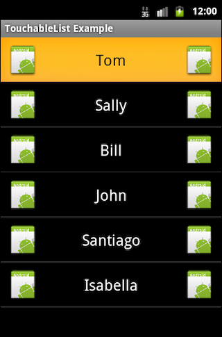
Now, the child views will only display their pressed states when actually pressed. They will no longer mirror the state of their parent.
Please feel free to download the sample code from this link to take a closer look at how all of this works together!