
Note:
ConstraintLayoutand the layout editor tools are currently in preview. The information in this post is based on the code and behavior ofconstraint-layout:1.0.0-alpha4. These behaviors may change as the tools approach final release.
Google I/O 2016 came with an announcement
of new tools and libraries designed to improve the layout experience building
Android applications. Android Studio has been equipped with a constraint-based
visual layout editor, coupled with the new ConstraintLayout container to interpret
those constraints at runtime.
This post is focused on examining the ConstraintLayout container architecture
and how it does its job. The features of the new Android Studio layout editor are
primarily designed to make the powerful and flexible features of this container
easier for developers to manage. By gaining a deeper understanding of ConstraintLayout,
we will be better equipped to use the developer tools.
Note:
ConstraintLayoutis distributed as an unbundled support library, so you will see many of the XML attributes in this post prefixed withapp:instead ofandroid:since they are coming from the local package namespace.
Let's begin by defining what a constraint is...
Types of Constraints
From the Google page linked above, a constraint placed on a view is
a description of how that view should be positioned on the screen relative to other elements in the layout.
In other words, constraints connect points on a view (called anchor points) to a target of some kind. That target could be:
- A related anchor point on a sibling view
- A related anchor point of the parent container
- A guideline (more on this later)
Each view supports the following anchor points as either the source or target of a constraint:
- Top, Bottom, Left, and Right (or Start and End)
- CenterX and CenterY
- Baseline (text-based views only)
In XML, constraints take the following format:
layout_constraint[SourceAnchor]_[TargetAnchor]="[TargetId]"
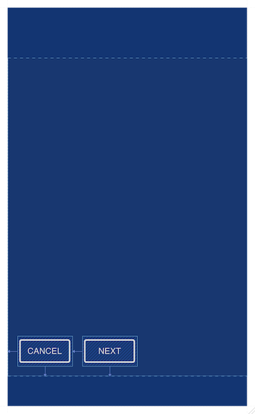
For example, a constraint between the end of @id/button_cancel and the start of
@id/button_next would look like:
<Button
  android:id="@+id/button_cancel"
  ... />

<Button
  android:id="@+id/button_next"
  app:layout_constraintStart_toEndOf="@+id/button_cancel"
  ... />
In the visual layout editor, when you connect these two views with an arrow to
represent the constraint, the tools simply add that line of XML to the file.
Here's a more complete example of some ConstraintLayout XML:
<android.support.constraint.ConstraintLayout
  xmlns:android="http://schemas.android.com/apk/res/android"
  xmlns:app="http://schemas.android.com/apk/res-auto"
  xmlns:tools="http://schemas.android.com/tools"
  android:id="@+id/constraintLayout"
  android:layout_width="match_parent"
  android:layout_height="match_parent">

  <Button
    android:id="@+id/button_cancel"
    android:layout_width="wrap_content"
    android:layout_height="wrap_content"
    app:layout_constraintStart_toStartOf="@+id/constraintLayout"
    android:layout_marginStart="16dp"
    app:layout_constraintBottom_toBottomOf="@+id/constraintLayout"
    android:layout_marginBottom="16dp" />

  <Button
    android:id="@+id/button_next"
    android:layout_width="wrap_content"
    android:layout_height="wrap_content"
    app:layout_constraintStart_toEndOf="@+id/button_cancel"
    android:layout_marginStart="16dp"
    app:layout_constraintBottom_toBottomOf="@+id/constraintLayout"
    android:layout_marginBottom="16dp"/>

</android.support.constraint.ConstraintLayout>
In this case, we have a few constraints aligning the Button views to the parent
container. They take the same format as we saw previously, but the target is the
id of the ConstraintLayout instance.
Tip: Constraints always reference targets by
android:id. If your views do not have an id attribute defined when a constraint is added, the Android Studio layout editor will create one for you in order to create the constraint.
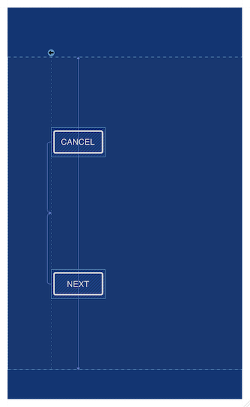
You may have also noticed from the last example that ConstraintLayout supports margins.
By default, a constraint between two views will be interpreted to align those views
immediately next to each other. Margins are required if you want to apply spacing
between them.
Sounds a lot like RelativeLayout so far, doesn't it?
Biasing Constraints
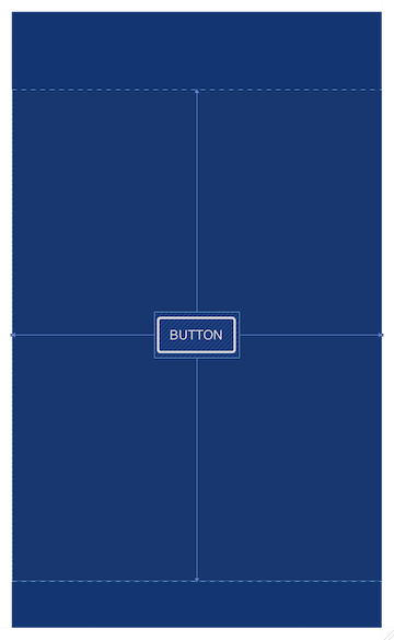
When a view is constrained on both sides of the same axis, it will be spaced evenly between the two target anchor points by default. The following XML centers a button inside the parent container:
<android.support.constraint.ConstraintLayout
  xmlns:android="http://schemas.android.com/apk/res/android"
  xmlns:app="http://schemas.android.com/apk/res-auto"
  xmlns:tools="http://schemas.android.com/tools"
  android:id="@+id/constraintLayout"
  android:layout_width="match_parent"
  android:layout_height="match_parent">

  <Button
    android:layout_width="wrap_content"
    android:layout_height="wrap_content"
    android:id="@+id/button"
    app:layout_constraintTop_toTopOf="@+id/constraintLayout"
    app:layout_constraintBottom_toBottomOf="@+id/constraintLayout"
    app:layout_constraintStart_toStartOf="@+id/constraintLayout"
    app:layout_constraintEnd_toEndOf="@+id/constraintLayout" />

</android.support.constraint.ConstraintLayout>
This is a nice feature on it's own, but ConstraintLayout takes it up a notch
with a concept called bias. Bias applies a weighted proportion to the pair
of constraints to unevenly distribute the spacing. For example:
<android.support.constraint.ConstraintLayout
  xmlns:android="http://schemas.android.com/apk/res/android"
  xmlns:app="http://schemas.android.com/apk/res-auto"
  xmlns:tools="http://schemas.android.com/tools"
  android:id="@+id/constraintLayout"
  android:layout_width="match_parent"
  android:layout_height="match_parent">

  <Button
    android:layout_width="wrap_content"
    android:layout_height="wrap_content"
    android:id="@+id/button"
    app:layout_constraintTop_toTopOf="@+id/constraintLayout"
    app:layout_constraintBottom_toBottomOf="@+id/constraintLayout"
    app:layout_constraintStart_toStartOf="@+id/constraintLayout"
    app:layout_constraintEnd_toEndOf="@+id/constraintLayout"
    app:layout_constraintHorizontal_bias="0.25"
    app:layout_constraintVertical_bias="0.25" />

</android.support.constraint.ConstraintLayout>
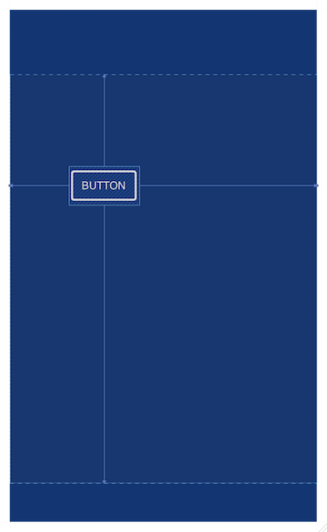
Now the same button is weighted with a 25/75 split of the available space on each
axis. This is more akin to the weight system in LinearLayout or GridLayout.
But it's even better than that, because the view doesn't have to fill the available
space in order to make use of it.
Tip: Technically, when no bias constraint is present, the bias is
0.5. This is why the default behavior is to center the view.
You can hopefully start to see how ConstraintLayout has the power to flatten view
hierarchies. It can behave like any of the existing framework layout managers,
or all of them at once!
Anchoring to Guidelines
In cases where an arbitrary anchor point is needed for view alignment, ConstraintLayout
supports guidelines. A Guideline is actually a subclass of View, and is
added to the layout just like any other child. Guidelines have a few special properties:
- They always measure their size to be 0
- They force their own visibility to
View.GONE
So while they exist as view in the container, they are never accounted for in layout. They exist purely to provide guideline attributes to define a horizontal or vertical anchor point for other view. Let's look at an example:
<android.support.constraint.ConstraintLayout
  xmlns:android="http://schemas.android.com/apk/res/android"
  xmlns:app="http://schemas.android.com/apk/res-auto"
  xmlns:tools="http://schemas.android.com/tools"
  android:id="@+id/constraintLayout"
  android:layout_width="match_parent"
  android:layout_height="match_parent">

  <android.support.constraint.Guideline
    android:layout_width="wrap_content"
    android:layout_height="wrap_content"
    android:id="@+id/guideline"
    android:orientation="vertical"
    app:layout_constraintGuide_begin="72dp" />

  <Button
    android:id="@+id/button_cancel"
    android:layout_width="wrap_content"
    android:layout_height="wrap_content"
    app:layout_constraintStart_toStartOf="@+id/guideline"
    app:layout_constraintTop_toTopOf="@+id/constraintLayout"
    app:layout_constraintBottom_toBottomOf="@+id/constraintLayout"
    app:layout_constraintVertical_bias="0.25" />

  <Button
    android:id="@+id/button_next"
    android:layout_width="wrap_content"
    android:layout_height="wrap_content"
    app:layout_constraintStart_toStartOf="@+id/guideline"
    app:layout_constraintTop_toTopOf="@+id/constraintLayout"
    app:layout_constraintBottom_toBottomOf="@+id/constraintLayout"
    app:layout_constraintVertical_bias="0.75" />

</android.support.constraint.ConstraintLayout>
A vertical guideline is set at 72dp from the start of the container. Each Button
can now use that guideline as its constraintStart target to align their edges
against the same arbitrary point. Guidelines can have one of three attributes:
layout_constraintGuide_begin: Absolute distance from the starting edgelayout_constraintGuide_end: Absolute distance from the ending edgelayout_constraintGuide_Percent: Percentage distance from the starting edge
From the perspective of constraints, a guideline is a valid target for any anchor point found on the same axis (horizontal or vertical). As such, it must also have a valid id defined.
Note: In the current alpha, there is a bug where the constraints are not properly honored if the
Guidelineappears after the views trying to reference it in the XML. To work around this, always add your guidelines first (in the visual editor) or manually place them at the top of your XML.
Editor-Only Attributes
If you use the visual layout editor at all, you will also see the following
tools:attributes appear on child views as well:
tools:layout_editor_absoluteXtools:layout_editor_absoluteYThese attributes do not affect the application at runtime. I repeat: They do not absolutely position the view on your devices. As the name (and
tools:prefix) implies, these are merely placeholders for the visual layout editor. As you drag views around on the editor, these attributes hold the current state so the canvas positions can be maintained.You will also see
tools:layout_constraint[Anchor]_creatorattributes if you use the editor's Autoconnect or Inference features at all. These attributes are used by the editor to track which constraints were added automatically versus those developers add explicitly. This allows the tool to avoid messing up constraints you put there yourself.
View Measurements
We've talked a lot about view positioning so far. I'd like to take a moment to
quickly discuss view sizing. ConstraintLayout applies slightly different sizing
rules to views than you are probably used to. There are three size definitions
that can apply to the width or height of any child view:
- Exact: Measure to a specific size (usually given in dp)
- Set
layout_widthorlayout_heightto a non-zero dimension
- Set
- Wrap Content: Measure to fit the view's content
- Set
layout_widthorlayout_heighttowrap_content
- Set
- Any Size: Measure to fill the available space for the attached constraints
- Set
layout_widthorlayout_heightto0dp
- Set
Whoa, curveball! What happened to match_parent?! ConstraintLayout doesn't
support it, and I'll explain why later. The short version is that any size
effectively replaces the match parent use cases in a way that better obeys the
constraints applied.
Tip: Any attempt to add
match_parentto a view from the visual layout editor will be overridden, and if you're crafty enough to add it from XML it will produce very awkward results in terms of gravity and positioning of content. Just don't use it.
Using any size, we can ask the view to stretch on that axis up to the attached constraints. Another example perhaps?
<android.support.constraint.ConstraintLayout
  xmlns:android="http://schemas.android.com/apk/res/android"
  xmlns:app="http://schemas.android.com/apk/res-auto"
  xmlns:tools="http://schemas.android.com/tools"
  android:id="@+id/constraintLayout"
  android:layout_width="match_parent"
  android:layout_height="match_parent">

  <Button
    android:id="@+id/button_cancel"
    android:layout_width="wrap_content"
    android:layout_height="wrap_content"
    app:layout_constraintStart_toStartOf="@+id/constraintLayout"
    app:layout_constraintTop_toTopOf="@+id/constraintLayout"/>

  <Button
    android:id="@+id/button_next"
    android:layout_width="0dp"
    android:layout_height="wrap_content"
    app:layout_constraintStart_toEndOf="@+id/button_cancel"
    app:layout_constraintEnd_toEndOf="@+id/constraintLayout"
    app:layout_constraintTop_toTopOf="@+id/constraintLayout"
    app:layout_constraintBottom_toBottomOf="@+id/constraintLayout" />

</android.support.constraint.ConstraintLayout>
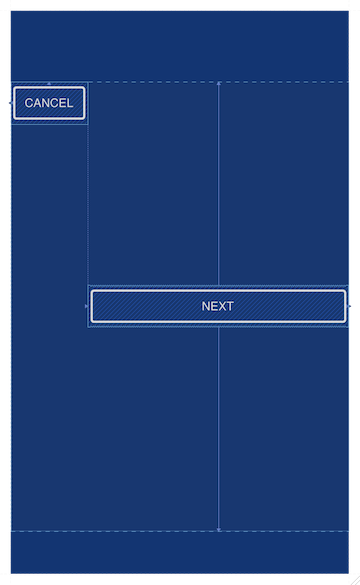
By setting layout_width to 0dp, the second button fills the space between the
end of the first button and the end of the parent container. This is again similar
to the current behavior of weights in the framework, but applied in a much more
flexible manner.
One More Thing...
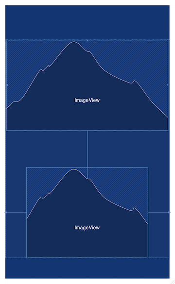
A common UI layout task involves sizing a view to a particular aspect ratio.
This is extremely common with images, whether it's square (1:1), 4:3, 16:9,
or something more custom. With ConstraintLayout, you will no longer have to
create a custom subclass of View or ViewGroup thanks to layout_constraintDimensionRatio.
This feature requires one of the dimensions in the attached view to be "known"
(fixed dimension or wrap_content) and the other to be "any size" (0dp). The
"any size" dimension will be measured to maintain the appropriate ratio set by the
constraint.
<?xml version="1.0" encoding="utf-8"?>
<android.support.constraint.ConstraintLayout
  xmlns:android="http://schemas.android.com/apk/res/android"
  xmlns:app="http://schemas.android.com/apk/res-auto"
  android:id="@+id/constraintLayout"
  android:layout_width="match_parent"
  android:layout_height="match_parent" >

  <ImageView
    android:layout_width="0dp"
    android:layout_height="wrap_content"
    android:src="@drawable/water"
    app:layout_constraintDimensionRatio="16:9"
    app:layout_constraintLeft_toLeftOf="@+id/constraintLayout"
    app:layout_constraintTop_toTopOf="@+id/constraintLayout"
    app:layout_constraintRight_toRightOf="@+id/constraintLayout"
    app:layout_constraintBottom_toBottomOf="@+id/constraintLayout"
    app:layout_constraintVertical_bias="0.0" />

  <ImageView
    android:layout_width="0dp"
    android:layout_height="wrap_content"
    android:src="@drawable/grass"
    app:layout_constraintDimensionRatio="4:3"
    app:layout_constraintLeft_toLeftOf="@+id/constraintLayout"
    app:layout_constraintRight_toRightOf="@+id/constraintLayout"
    app:layout_constraintBottom_toBottomOf="@+id/constraintLayout" />

  ...

</android.support.constraint.ConstraintLayout>
Sorry SquareImageView and AspectImageView, we have no need for you anymore...
What's Next?
Hopefully you now have a solid understanding of what ConstraintLayout can do,
even if you don't have the layout editor tools to lean on. The XML generated for
constraints is quite straightforward and intuitive to follow once you understand
the syntax.
In the next post, we are going to focus on
how ConstraintLayout solves all those constraints to provide the view
positions and sizes. We'll be diving into the implementation to understand the
mechanics at play during the measure and layout passes at runtime.
Note: You can see more examples of
ConstraintLayoutin action by visiting the Layout Pancake sample repository on GitHub.